We set out to revamp the onboarding experience for first-time users in a way that meets user expectations, adheres to usability principles, and aligns with our business goals.
For this project I created wireframes, defined flows and customer journeys, and designed the UI. The project took about 4 weeks to complete and the stakeholders were the product team managers, development and marketing teams, and leadership.
"I heartily recommend Cam. They are very talented designer, and a great teammate. Cam had a challenging job of being the sole UI/UX designer at Ripl - a team of one - and was able to do it all: building and maintaining UX/UI assets, generating competitive and user research, partnering in our dev sprints & product planning, and leading user testing on new features. They demonstrated knowledge and empathy for our users and provided expert design to our web, iOS, and Android platforms. Lastly, Cam is amazing in Figma. While at Ripl, Cam up-leveled the quality and governance of our design tools, like building out a component library to streamline design assets and prototyping."
Justin Emerick
Director of Product Management @ Ripl
First-time Ripl users often failed to complete sign up or abandoned rather than trialing the app. Our analytics showed that users didn’t always make it through onboarding, so we wanted to increase the amount of users who completed sign up and got to the core action of the app of customizing templates. The primary goal of this project was to increase trials and encourage users to create and share their first post to see the value of the app as a solution to their social media content creation.
High Abandonment Rates
Low User Activation
User Frustration
Increased user conversion rates
Faster time-to-value
Reduced abandonment rates
Data-driven decision making
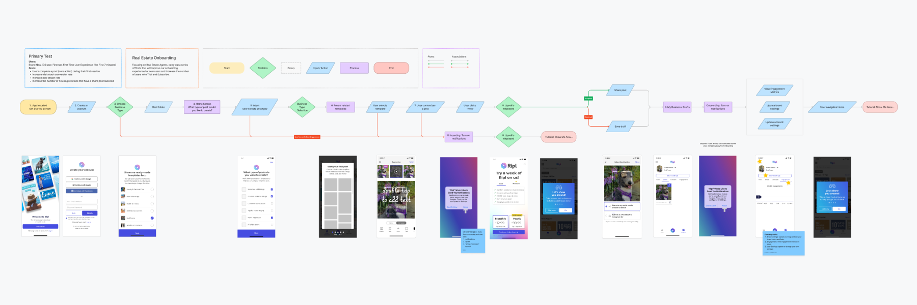
During the onboarding flow, we saw opportunities to improve the user journey from app launch to upsell. One important factor was that the more information we gather from the user, the better we can tailor the app to their needs and expectations. When the user is asked to take investment steps like selecting their business type and uploading their brand assets, the app feels more like it’s personalizing the experience for them which is valuable when asking the user to move through multiple steps. The user journey shows the frustrations and pain points a user experiences along with positive aspects. Some of the opportunities we discovered were investment steps, personalization, and priming the user before asking them for information or to take an action.
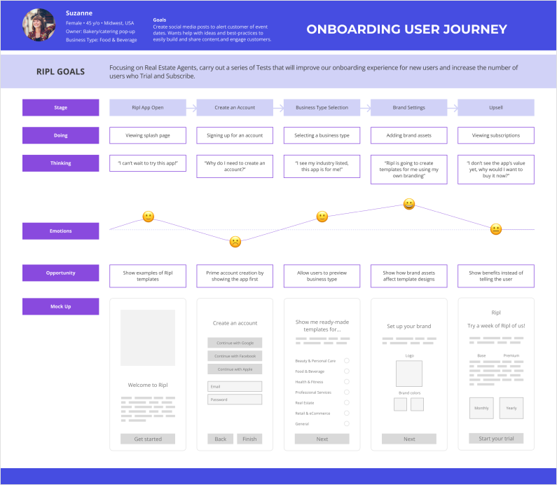
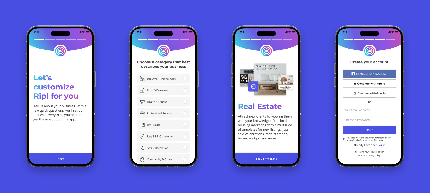
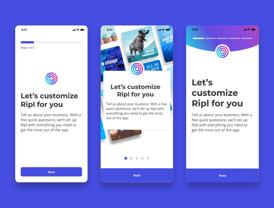
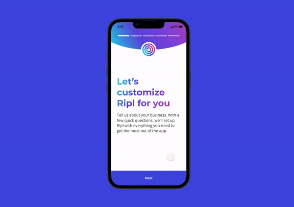
Some of the design concepts I wanted to explore during onboarding were adding a progress bar indicator to show the user what stage they were in the account set up process, adding primer screens to introduce and explain next steps, and updating the UI component styles for consistency. I created simple wireframes to focus on the layout and usability before mocking up designs and creating a prototype.
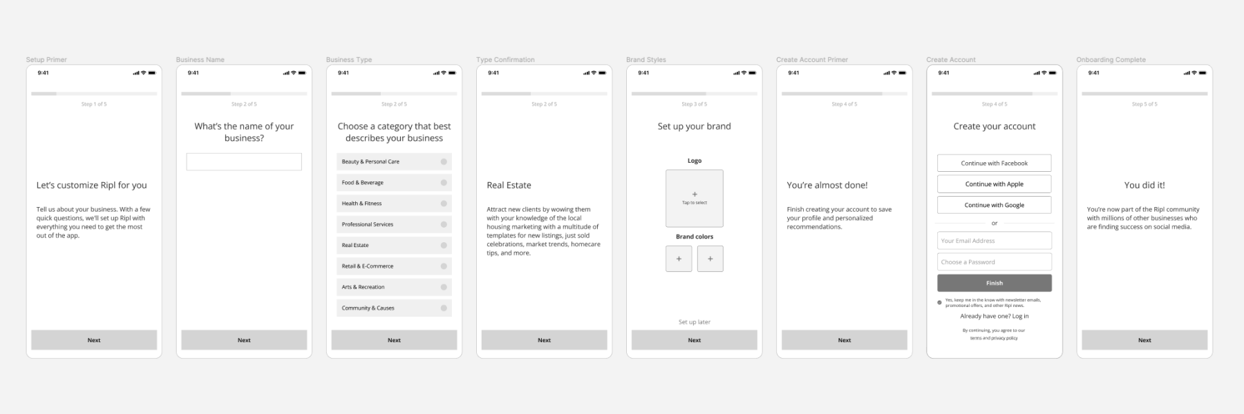
After validating the wireframes and getting stakeholder buy in, I fleshed them out into a few different design styles and created a prototype using the favorite of the designs. I had internal employees test out the prototyped flow and asked them subjective and qualitative questions about how it felt to go through each step. I wanted to know if there was any friction and how useful the brand setup process felt and whether the priming screens were encouraging or discouraging as they went through sign up. The overall consensus was positive, so with a few tweaks we decided to launch an A/B test against our current flow.
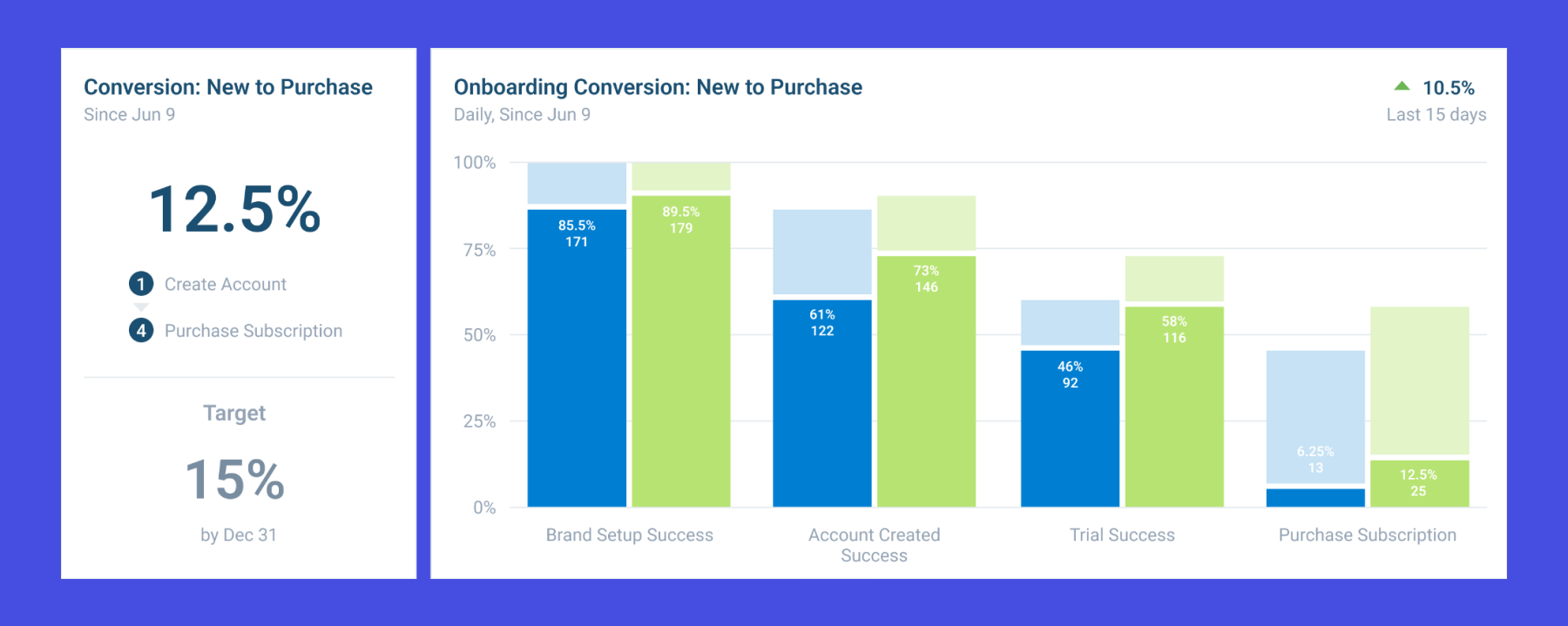
At the end of the A/B test, we found the challenger design to be the winner. We saw a 6.25% increase in subscription purchases and 12% increase in overall sign up completion. We also tracked the amount of successfully shared posts during the user’s first session and saw a small increase of 3.5%.
Overall, this project was a success. It reaffirmed our responsibility to user-centered and hypothesis-driven design. In the future, I would have liked to continue testing the ordering of screens and copy content. There are continued opportunities for iterations and I think this was a major step in the right direction.