We set out to ensure the application meets user expectations, adheres to usability principles, and aligns with our business goals.
The app redesign project focused on addressing user concerns and modernizing the app to exceed industry standards. This included a complete overhaul of the user interface, the addition of missing and desired features, optimization for performance and stability, and aligning the app with market expectations. I was responsible for defining the problem and scope, auditing the current app, gathering user data, analyzing competitors and researching the industry, evaluating usability heuristics and accessibility, creating user flows, wireframing, creating hi-fidelity designs, front-end development, and validation.
“The app is so easy to understand and has made my job a lot easier, especially being able to add a cure's information directly. Now I just log into the dashboard and I can see exactly what I want to know about how [my employees] are recording and logging data.”
“Setting up the AutoCure was a breeze. It didn't take long for me to learn how to use it and start new cures right away.”
“We've been using the design framework you created for years and our customers love it.”
Daniel Kozlowski
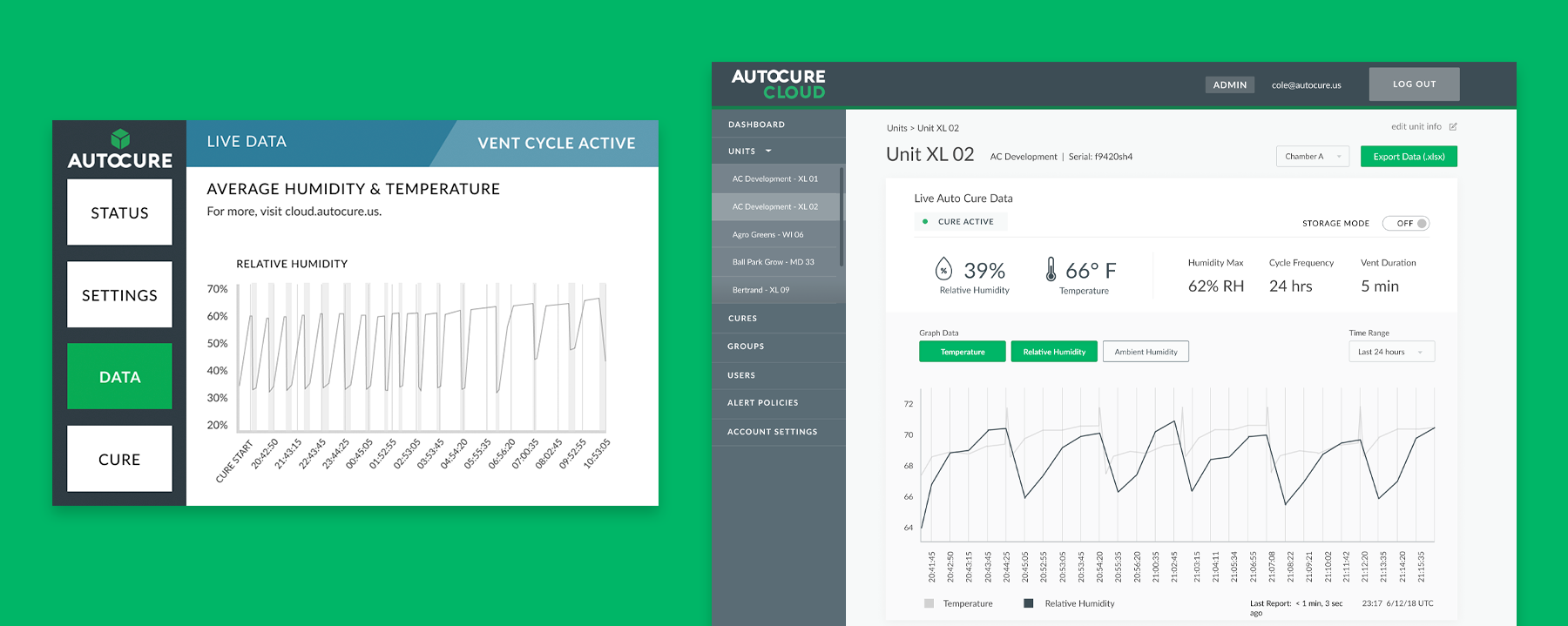
AutoCure's interface was initially designed by a developer with no UX training. Despite AutoCure's initial success, the interface was outdated and no longer aligned with the evolving needs and expectations of the user base. The problem we were trying to solve for was to improve user satisfaction through onboarding, better usability, and an updated UI. The app redesign project focused on addressing user concerns and modernizing the app to exceed industry standards. This included a complete overhaul of the user interface, the addition of missing and desired features, optimization for performance and stability, and aligning the app with market expectations.
Integration of UI Elements
User Training & Adoption
User Frustration
User satisfaction & Retention
Reduced Training Costs
Increased User Recommendations
Competitive Advantage
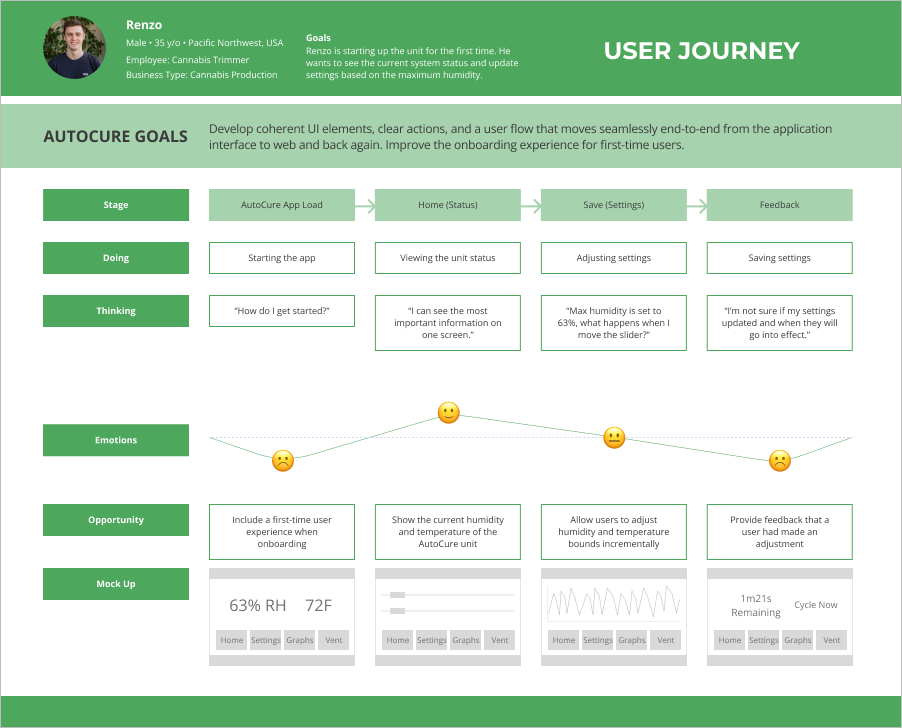
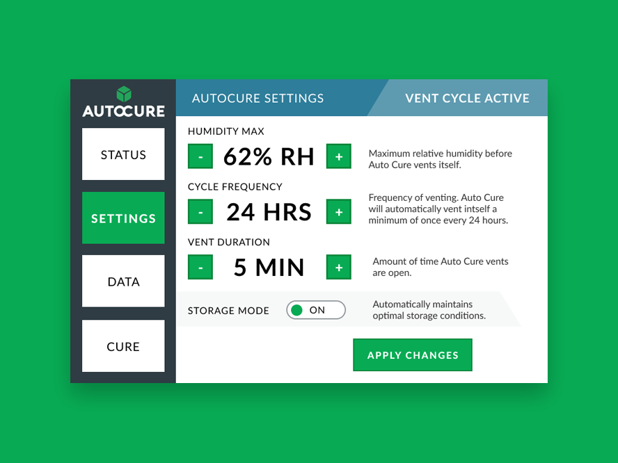
During the user journey, we saw opportunities to teach new users how to use the app and provide feedback when they took actions like adjusting and saving settings. In the current version of the app, there was no confirmation when a setting was changed and no option to discard changes. It felt frustrating and confusing to users who want to ensure that their changes were made without needing to wait and see the temperature and humidity adjust over time. We decided to create a simple tutorial for first-time users and provide real-time feedback when a setting is adjusted and saved.
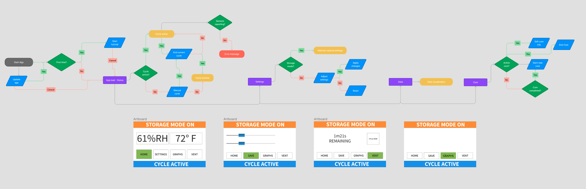
The design concepts I wanted to explore were system-wide status visibility, feedback on user actions, an onboarding tutorial, and the ability to add cure information. I created some simple wireframes to focus on the layout and usability before mocking up hi-fidelity designs.
Design concepts:
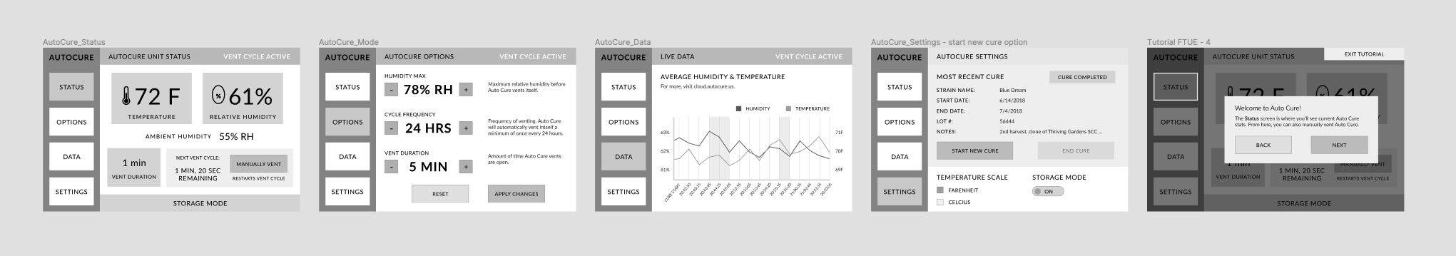
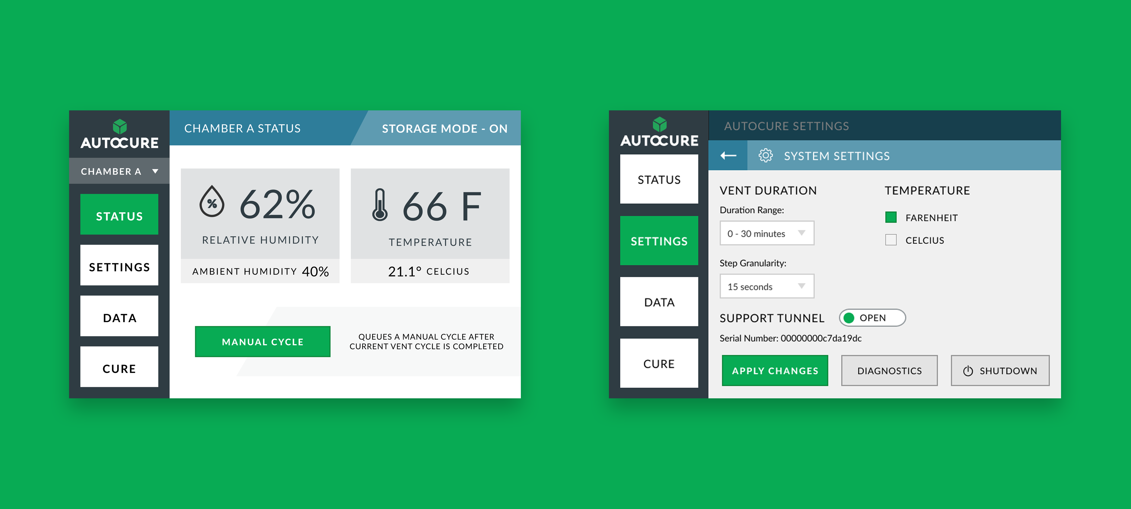
After receiving stakeholder buy-in, I mocked up wireframes into hi-fidelity designs, starting with the first-time user experience. The user is given the option to start a tutorial or skip and exit at any time. It walks the user through by showing the most important aspects of the app along with the locations that settings can be adjusted. The tutorial is linear rather than contextual, which is something that I would change in the future given the opportunity. Contextual tips are more likely to be remembered by cutting down cognitive load.
In conclusion, we saw reports of high user satisfaction in the app and a reduced need for in-person training. Users loved the design updates and found significant value in the first time tutorial and Cure feature. As a small startup, after launch and when the project was concluded, I began the next project at AutoCure. If I were to return to this project, I would want to conduct more in-person user interviews to understand how their workflow has changed since the app’s update and what pain points there are. Since it’s been a few years, I can see more opportunities and would want to iterate on designs with more user feedback.